Customer service
Corporate identity
HOME > Customer service > Corporate identity
Symbol Mark


It is a visual representation of the image WIDIN pursues.
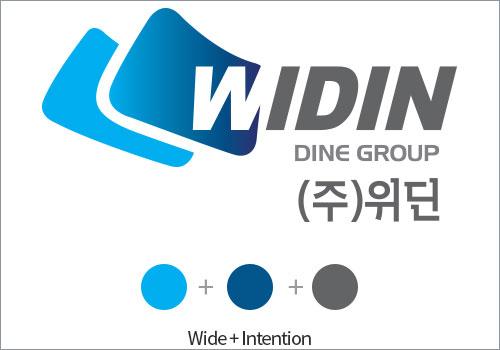
Blue gradation represents the way of change, development that WIDIN should pursue.
The type of font shows dynamic and strong will of our management
WIDIN is a combination of 'Wide' and 'Intention' which means constantly changing and developing towards the goal.
The overall shape represents growth, progress, and development and the spirit of stretching out from WIDIN as unformatted arrows.

Blue Gradient : To express the image of a company spreading out around the world.
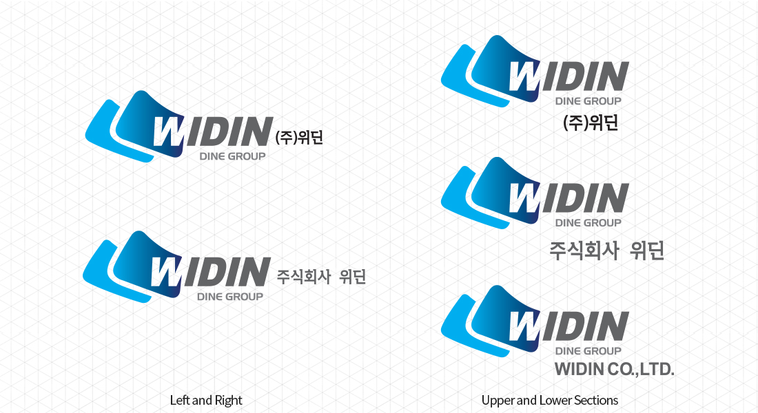
Logo

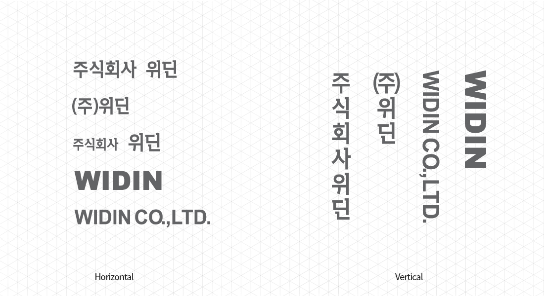
Signature


